A self-initiated redesign of the Netflix children's experience, exploring how a platform originally designed for adults can be meaningfully adapted for a younger audience without disrupting the familiar patterns parents rely on. Netflix’s Kids experience has historically mirrored the adult interface, relying heavily on text-based navigation and content rows. However, younger users interact differently, relying more on visual recognition, repetition, and simplicity.
Challenge
Netflix's children's account uses the same UI framework as its adult product: a visually dense, dark-themed interface built around discovery and browsing. For young children, this creates a mismatch: the interaction model assumes reading ability and fine motor control that many of the target users don't yet have, and the visual language doesn’t signal that this is a space designed for them.
(Note: Netflix has since shifted toward more visual, character-driven interfaces as proposed.)
Initial thoughts
The key to this redesign was balancing two distinct user groups: children, the primary content consumers, and parents, who manage accounts, set up viewing, and need to navigate the platform themselves.
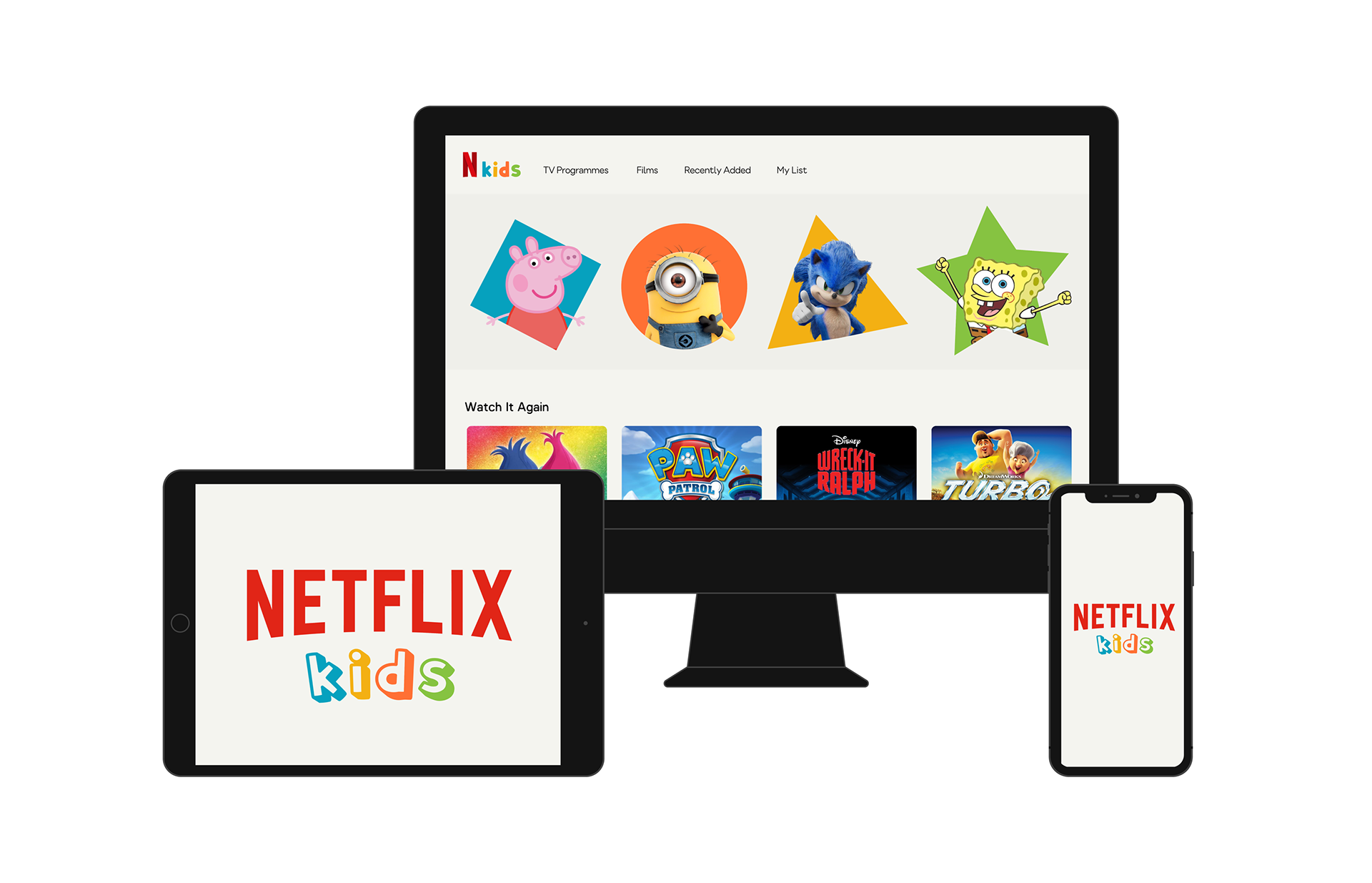
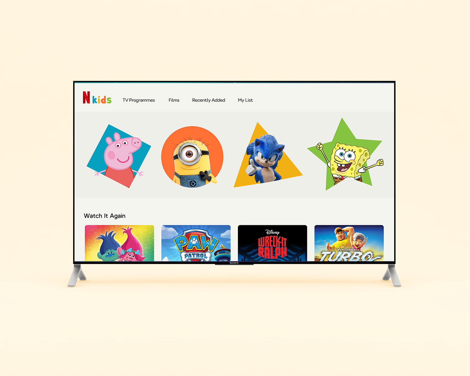
Recognition over reading - prioritize characters, thumbnails, and imagery over text labels to align with how children naturally identify shows by characters rather than titles.
Reduce choice overload - limit visible options and create clear hierarchy to reduce friction and decision fatigue.
Playful but structured - balance fun visuals with predictable navigation patterns.
Design approach
To resolve this, I kept the underlying navigation largely intact so that the experience would remain immediately familiar to parents. The intervention was purely at the visual and interaction layer:
Shape-based content cards - replaced standard rectangular thumbnails with brightly-coloured geometric shapes to create a more playful, tactile feel and give the content row stronger visual distinction from the adult UI.
Brighter, high-contrast palette - shifted away from the dark Netflix aesthetic to a light, warm-toned background with bold, saturated colours more aligned with how children are proven to respond to visual stimuli.
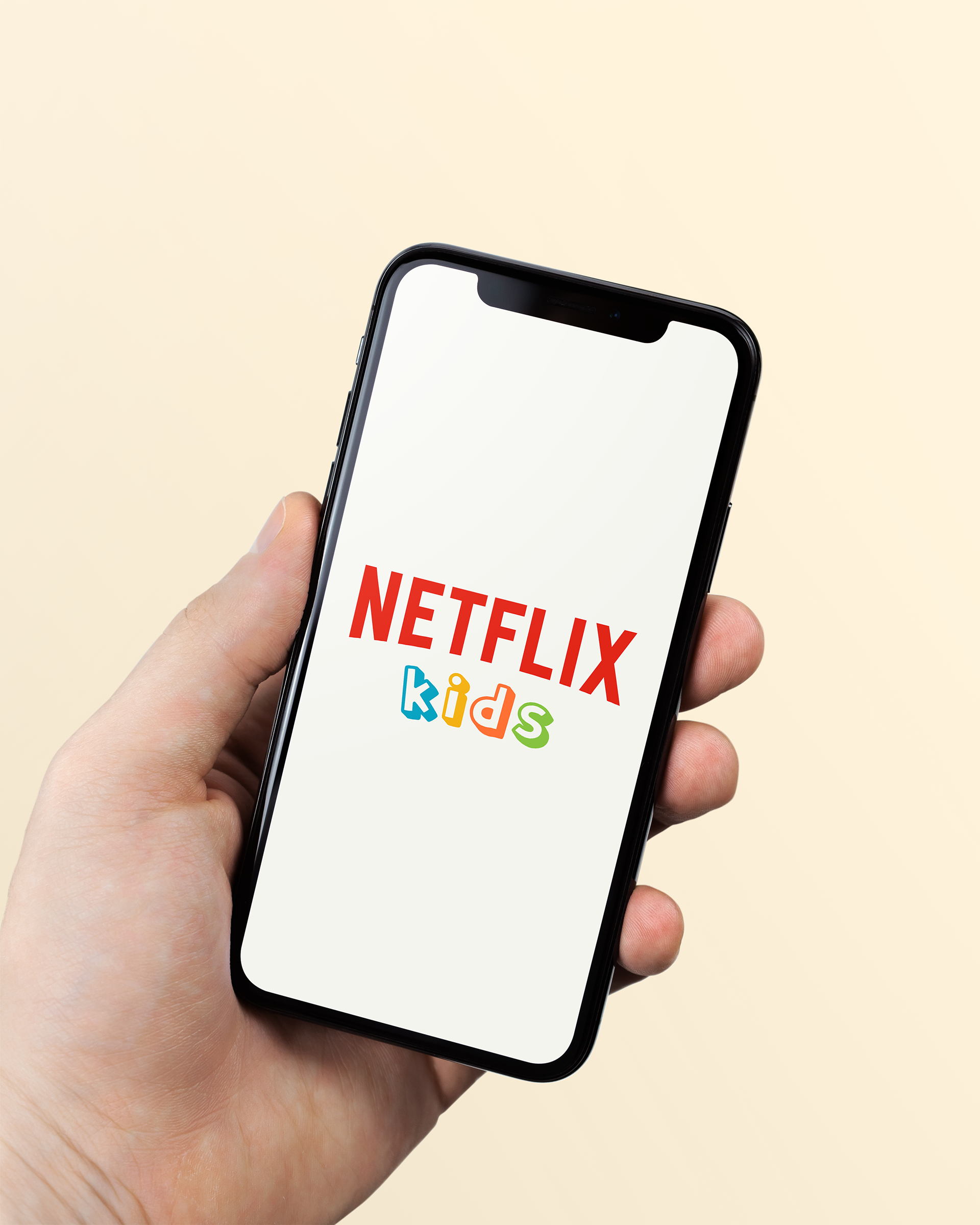
Simplified wordmark - paired the Netflix logotype with a multi-coloured, rounded "kids" sub-brand in a chunky, approachable typeface to establish a clear distinction from the start-up screen.
What I'd explore further
This project shifted my approach from purely visual design to experience design.
My key takeaways:
✦ Designing for specific user groups (like children) requires different assumptions.
✦ Visual style is most effective when it directly supports usability.
✦ Systems thinking (components, hierarchy, scalability) is essential for product design.
Given more time, the next design considerations would be around further navigation for children pre-reading age (icon-led rather than text navigation), gamification utilising the shape/colour association for tablet view, and further thought into implementing parental controls.
Completed as a personal project, from concept to presentation in approximately 1.5 hours.